Choosing the right paint color can transform a space, creating an atmosphere that reflects personal style and enhances the overall aesthetic of a home. In the world of interior design, mastering the art of selecting perfect paint hues is a skill that can elevate any room. Understanding the nuances of color and how they interact with light, space, and furnishings is essential for achieving a harmonious look. This exploration delves into expert tips for selecting the ideal paint colors, providing insights that can guide homeowners and designers alike in their quest for color mastery.
Understanding Color Theory
Color theory is the foundation of selecting the perfect paint hues. It involves understanding the color wheel, which is divided into primary, secondary, and tertiary colors. Primary colors—red, blue, and yellow—are the building blocks of all other colors. Secondary colors, such as green, orange, and purple, are created by mixing primary colors. Tertiary colors result from combining primary and secondary colors. Knowing how these colors interact is crucial for creating a balanced palette. Complementary colors, which sit opposite each other on the color wheel, can create vibrant contrasts, while analogous colors, which are next to each other, offer a more harmonious look.
Considering Natural and Artificial Lighting
Lighting plays a significant role in how paint colors appear in a room. Natural light can change throughout the day, altering the perception of color. For instance, a color that looks warm and inviting in the morning light might appear cooler in the afternoon. Artificial lighting, such as incandescent, fluorescent, or LED lights, can also affect color perception. Incandescent lights tend to enhance warm tones, while fluorescent lights can make colors appear cooler. When selecting paint colors, it's important to test samples under different lighting conditions to ensure the color remains consistent and appealing at all times.
Choosing the Right Finish
The finish of a paint can impact both the appearance and durability of the color. Common finishes include matte, eggshell, satin, semi-gloss, and gloss. Matte finishes offer a non-reflective surface that hides imperfections, making them ideal for ceilings and low-traffic areas. Eggshell and satin finishes provide a slight sheen, adding depth and durability, which are suitable for living rooms and bedrooms. Semi-gloss and gloss finishes are highly reflective and durable, making them perfect for kitchens, bathrooms, and trim work. Selecting the appropriate finish can enhance the color's effect and ensure it withstands the demands of the space.
Testing Paint Samples
Testing paint samples is a critical step in the color selection process. Applying small patches of the chosen hues on different walls allows for observation of how the colors interact with the room's lighting and furnishings. It's advisable to test samples in various sizes and on multiple walls to see how they look at different times of the day. This practice helps in making an informed decision, ensuring the final choice complements the room's overall design. Observing the samples over a few days can provide insights into how the color will perform in the long term.
Coordinating with Existing Decor
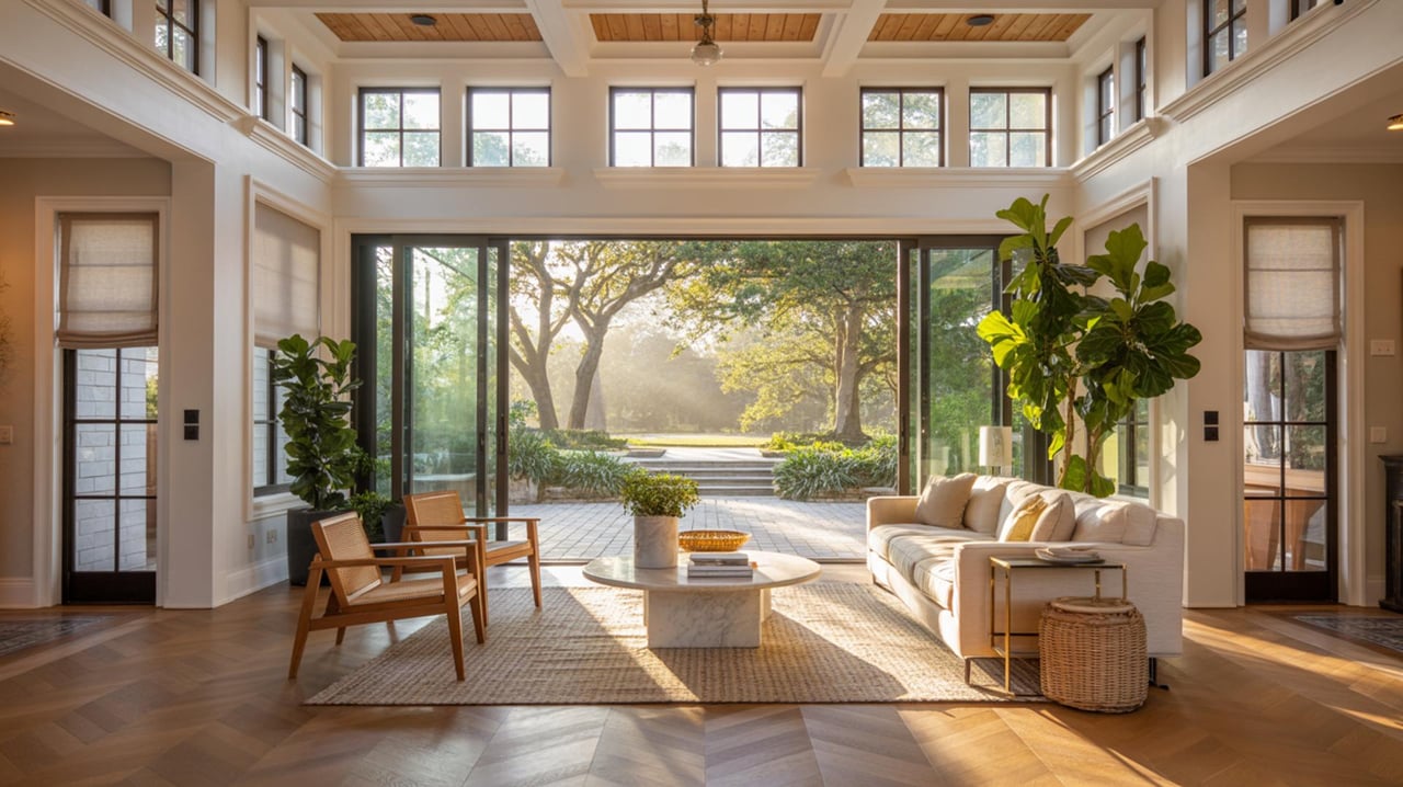
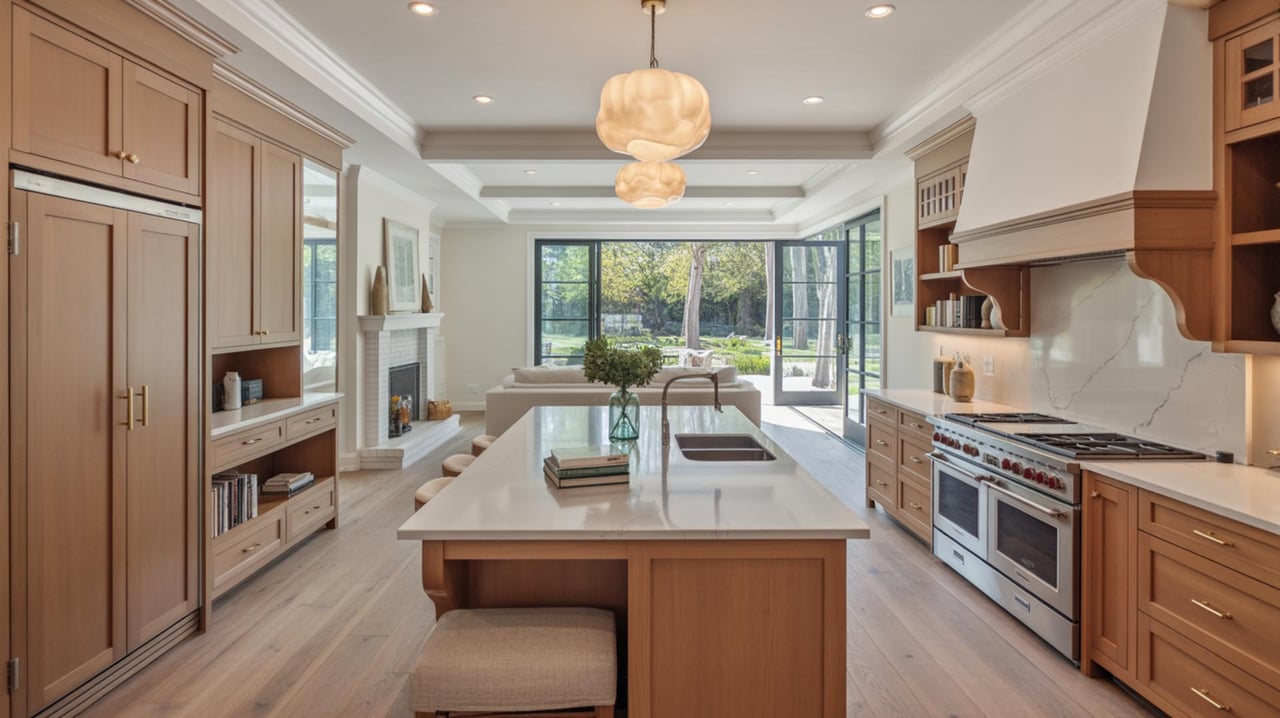
Harmonizing paint colors with existing decor is essential for creating a cohesive look. Consider the colors of furniture, artwork, and textiles in the room. Neutral colors, such as whites, grays, and beiges, often provide a versatile backdrop that complements various styles and color schemes. For a more unified appearance, choose paint colors that echo or complement the hues found in the room's decor. This approach ensures that the paint color enhances the overall aesthetic without clashing with existing elements.
Understanding the Psychology of Color
Colors can evoke emotions and influence mood, making it important to consider the psychological impact of paint hues. Warm colors like red, orange, and yellow can create a sense of energy and warmth, making them ideal for social spaces like living rooms and dining areas. Cool colors such as blue, green, and purple can evoke calmness and relaxation, perfect for bedrooms and bathrooms. Understanding the emotional response associated with different colors can guide the selection process, ensuring the chosen hues align with the desired atmosphere of the space.
Exploring Current Trends
Staying informed about current color trends can provide inspiration and direction when selecting paint hues. Design magazines, online platforms, and paint manufacturers often showcase the latest color palettes, offering insights into popular choices. While trends can offer fresh ideas, it's important to balance them with personal preferences and the room's overall design. Incorporating trendy colors as accents or in smaller areas can keep a space feeling modern without overwhelming the existing decor.
Seeking Professional Advice
Consulting with a professional interior designer or color consultant can provide valuable insights and expertise in selecting the perfect paint hues. These experts can offer guidance on color theory, lighting, and finishes, ensuring a cohesive and aesthetically pleasing result. They can also provide access to a wider range of color options and resources, making the selection process more efficient. Engaging a professional can be particularly beneficial for large projects or when seeking a unique or complex color scheme.
Utilizing Color Tools and Apps
Modern technology offers a variety of tools and apps designed to assist in selecting paint colors. These digital resources can simulate how colors will look in a space, providing a visual representation before any paint is applied. Many apps allow users to upload photos of their rooms and experiment with different hues, offering a convenient way to explore options. Utilizing these tools can simplify the decision-making process, providing confidence in the chosen colors.
Balancing Bold and Neutral Colors
Achieving a balance between bold and neutral colors can create a dynamic yet harmonious space. Bold colors can add personality and drama, while neutral tones provide a calming and versatile backdrop. When incorporating bold hues, consider using them as accent walls or in smaller areas to prevent overwhelming the space. Neutral colors can be used to balance out bold choices, creating a cohesive and inviting environment. This balance ensures that the space remains visually interesting while maintaining a sense of harmony.
Transform Your Space with the Right Colors
Mastering the art of choosing the perfect paint hues can truly transform your living space, making it more inviting and reflective of your personal style. With these expert tips, you're now equipped to make informed decisions that will enhance the beauty and value of your home. If you're looking for more personalized advice or planning to buy or sell a property, the Se7en Realty Group is here to help. Reach out today to discover how they can assist you in making your dream home a reality.